
It looks like Peugeot will be using an old logo or a retro version of it in the near future. It would mean the biggest change in decades.
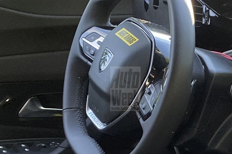
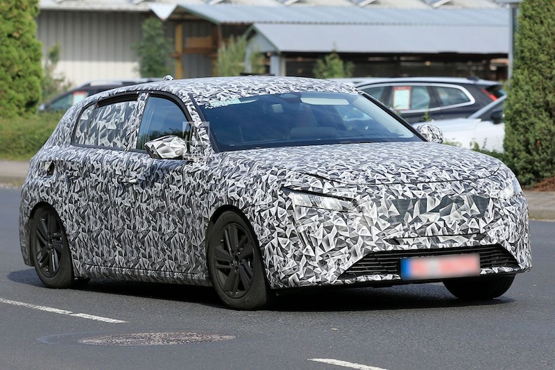
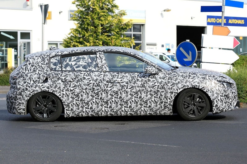
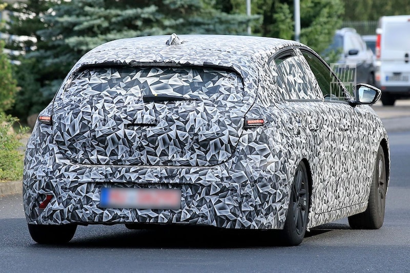
Peugeot has been broadly using the current logo since the late 1990s. In fact, the upright lion has been used since the 1950s. Until the early 1970s, that lion was in a shield and the brand name was above it. A slightly different variant, in which there was no lion in its entirety but a detailed lion’s head, was also in circulation for a long time. The latter logo now seems to be returning to Peugeot. In the testing new Peugeot 308 that our spy photographer spotted, that ‘new’ logo was already on the steering wheel (see photo 1). By the way, we also saw it with the E-Legend Concept (photo 3), but now it has found its way to a production car.
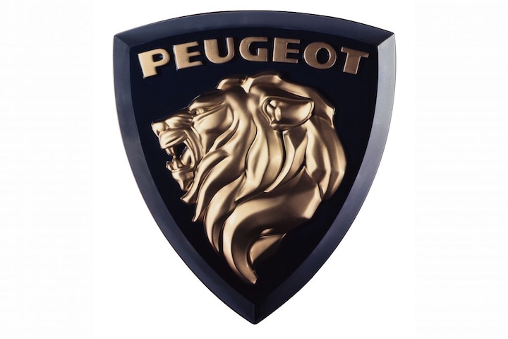
The (original) logo in question
Peugeot is by no means the first brand to overhaul its logo. Numerous brands, including Volkswagen, BMW and Nissan, recently introduced new logos. In general, more two-dimensional logos are chosen, because they ‘work better in the current digital era’. However, Peugeot seems to be returning to the past. The ‘classic’ logo has been slightly adapted to a more two-dimensional version.