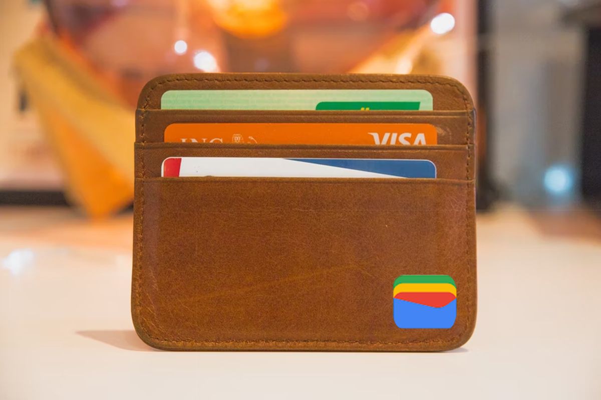
The Google Wallet is back and in the July update of the Play Store we see more of the rebranding of that virtual wallet. The update is a bit later than usual, but that should not spoil the fun. The Wallet now also features Google’s Material You design.
Google Play Store Update
Android developers have new ways to build smoother experiences for multiple devices. This is likely related to the ‘Nearby Share’ APIs that Google announced at Google I/O. Google also wants to make it easier to understand what’s new in an Android update. That is a big advantage: if you have little understanding of telephones, you often have no idea what to expect after an update. It is just not clear whether it concerns major updates, such as those to a new Android version, or, for example, security updates.
Other adjustments that come with this update are, for example, the Data & Privacy section that looks slightly different, but also that playing while the game is still downloading is made better, so that you don’t have to wait as long. It should also be easier to discover cool apps and games, there are improvements to the invoicing of Google Play and of course the necessary bug fixes.
Google Wallet
We’ve written about the Google Wallet more often this year, because it’s back. In this update, it has been given the cheerful color splendor of the Google Material You design and is now called Google Wallet again. In short, all the way back to record all your payment details and customer details lay.
Curious if your device is already next? Then go to your avatar within the Play Store, tap ‘Settings’, then ‘About’ and then ‘Update Play Store’.
Are you planning to use the Google Wallet a lot, or do you already have another app for this? Leave it now as a comment to this article.
– Thanks for information from Androidworld. Source