

In a new series, we ask today’s car designers how they draw inspiration from their brand’s legacy. We do this by meeting them in the museum or in the warehouses of their brand, among the classics and prototypes from bygone times. We start with Opel.
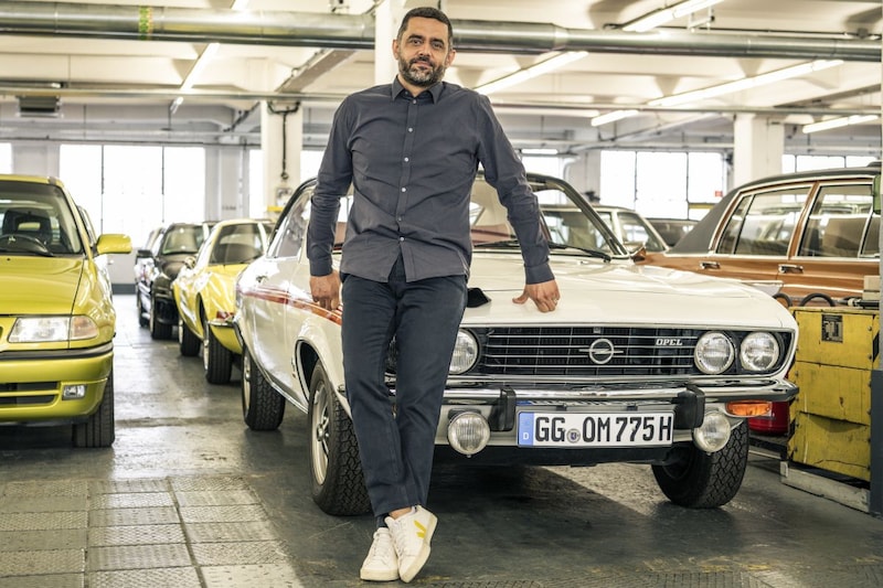
At Opel Classic in Rüsselsheim, Germany, we speak to Pierre-Olivier Garcia, Global Brand Design Manager at Opel.
What has been the main thread running through Opel’s design over the years?
“Opel’s design has always been tough, but not aggressive. Mainly purist; all forms have been reduced to the essence. That is surely the most important characteristic of Opel. Of course we have deviated from that line on occasion, but we keep coming back to it, with the current design philosophy perhaps more than ever before. The Opel Vizor front, which we first saw on the new Mokka, is the perfect example. Tough, but simple. Easy to understand and very recognizable. Not aggressive, but very confident. Another typical characteristic of Opel is the use of graphics: stripes, black areas, two-dimensional shapes. A great example of this is the Opel GT Diesel concept car from 1972. Opel has always been a forerunner in this area. This is also reflected in the design of sporty Opels and historic rally cars. The black hood is a good example. We also play with this in our contemporary design, such as with the Mokka. The typical combination of yellow and black, which has already been used on Opel bicycles, is iconic.”
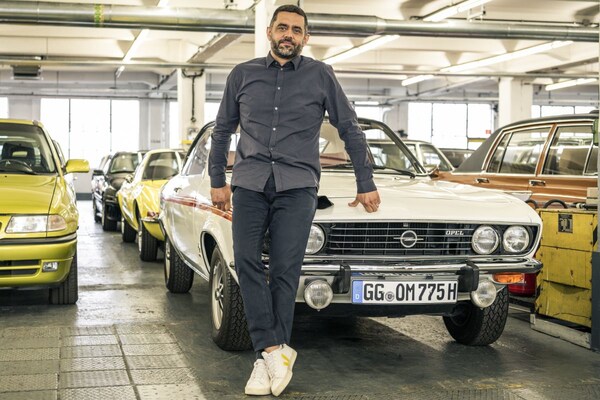
Pierre-Olivier Garcia at the Opel Manta A
What is the most iconic Opel in that area?
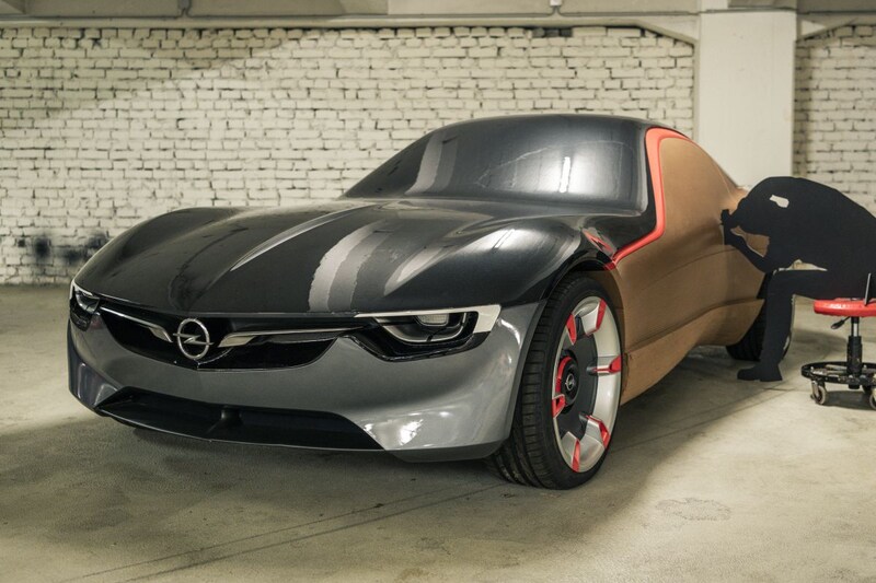
“For me, that’s the Manta A. Personally, I get a lot of my inspiration from the design in the 1970s anyway. It’s no coincidence that the new Opel Vizor face is partly inspired by the nose of the first Manta. Opel stands for very simple ‘graphics’ in design. When we developed the latest design language, we asked ourselves how we could translate the typical German design tradition such as Bauhaus into the face of Opel. We did not want to deviate from the German principle ‘form follows function’. The typical clear lines and the use of tightly defined surfaces fit perfectly into Opel’s design tradition. It is not for nothing that we have made the Manta GSe Elektromod. That car shows how you can successfully combine old and new.”
What is your biggest challenge in translating brand tradition into new design?
“The biggest pitfall is that you create something that is merely a modern translation of something classic. That’s not what it’s about. It’s about going back to the core values of the brand and translating that essence into something new, something contemporary. In daily practice it is sometimes difficult to translate the requirements of a platform into something you have in mind. Fortunately, at Stellantis we now have a very flexible structure of building blocks that we can work with. We have a lot of freedom to design real Opels with the technology of the group. The latest examples show that clearly, don’t they?”
Which Opel is your biggest source of inspiration?
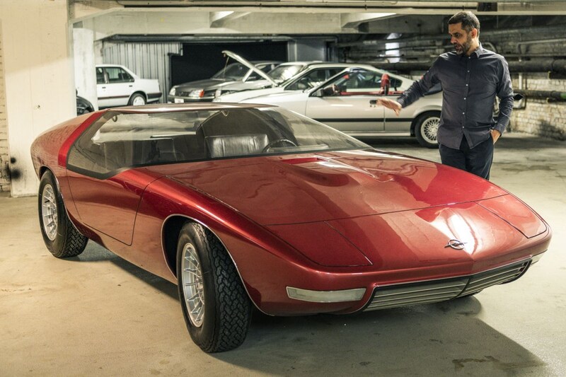
“That is without a doubt the Opel GT. Despite its flamboyant appearance, that car was very characteristic of the Opel brand. It wanted to create a sports coupé that was accessible to everyone: typical Opel. At first it was even intended as a ‘Kadett Coupé’. Another model that scores highly for me is the CD Concept, which unfortunately never went into production. That car is so pure in form. That interior, in which nothing distracts the driver from what is important. We took a lot of inspiration from this when devising the new Opel Pure Panel.

Opel CD Concept
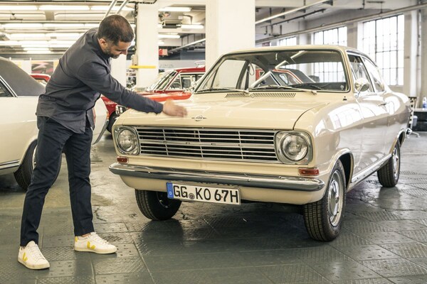
As designers, we can regularly be found among the cars at Opel Classic. In the classic Opels you always see a detail on which you can build further, you discover where the essence of the brand is. Awesome! You also discover cars that are not good examples, such as the Insignia Concept that is here. It was not pure, not simple. What is immediately noticeable: it is not timeless at all. I want to emphasize that not only cars inspire us. Opel is a German brand, so we also go back to the question: what is typically German? Within that framework, we must realize that we are a mainstream brand. You should see that reflected in our design. At the same time, Opel has always been a ‘young’ brand. Not so much hip, but young at heart. For example, we look at other German brands, such as Adidas. That’s mainstream too. But look what that brand is doing with the iconic Stan Smith shoe. And the simple ‘graphics’ of the three stripes. Back to the essentials, but keeping with the times. Beautiful.”
How important is the legacy of a brand in 2022?
“It is becoming increasingly important. In the era of electrification, it is difficult to distinguish yourself with drive or technology. It’s a big equalizer. It is precisely then that you have to go back to the essence of what your brand stands for and translate that into new products. The soul of a brand then becomes leading. Electric mobility can then be very attractive. Just look at our GSe Elektromod! Our job as a design team is to read the lines, discover the common thread and translate it into new shapes and ideas. In this way we continue to distinguish ourselves, just as our sister brand Citroën continues to distinguish itself on comfort. That is the soul of that brand.”
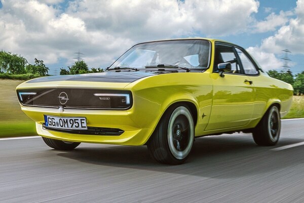
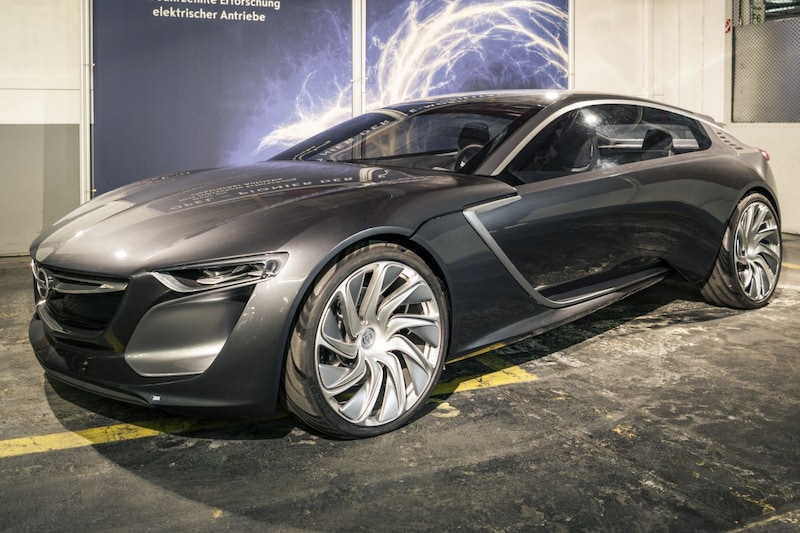
The Opel Manta GSe Elektromod, a unique one-off
What do you think is a good recent example of modern design with a clear history?
“The Opel Mokka. That car sits at the heart of today’s mass market: a B-segment SUV. Those cars are often very similar, a lot is a dime. With the new Mokka we have really shown that things can be done differently. That you can create individuality without playing tricks or having to come up with forced references to your brand. Compared to previous generations, we have returned to the essence of Opel: clear and simple. Everything has a reason, everything has a function. That’s Opel. Still, that tough element is there. A little rebellious. Opel has always had that. Four years ago, we started redefining our brand face. We showed this for the first time in the GTX Concept and then in the Mokka as a production car. That design philosophy is rock solid. From now on, we will continue to build on it, depending on the segment in which a new car has to operate. The new Astra is a good example of this.”
At what point in the design process do you delve into history?
“That is precisely in the first phase. As I said, we at Opel now have a clear design philosophy. That is central. But in the creative first phase, in which we make a lot of free sketches, it is wonderful to find inspiration in the collection of classic and newer Opels. Also before that we went to wander around here between the Kadetts, Ascona’s and early Astra’s. Always delivers good ideas. We also noticed how pure Opel’s lines have almost always been. Look at the front of a D-Kadett. That is a translation of what we now call the Opel Vizor. This way you discover that many different interpretations of one idea are possible. This allows us to get started as a design team.”
Does brand history also play a role in interior design?
“Absolutely! We discovered that Opels are often tough on the outside, but extremely simple on the inside. ‘Detoxing the interior‘ we call that. We have translated the idea of the simple Opel Vizor, where all lighting, sensors and cameras are hidden behind one panel, to the interior. We call that the Opel Pure Panel. We have also found inspiration for this in Opels from the 70s and 80s. From the Manta and the Kadett to the CD Concept. Everything is concentrated in one place. This German Bauhaus design principle is also reflected here: everything must have a function. Please note: within Stellantis we are the only German brand. We must emphasize that. Efficiency is typically German. Focus is also typically German. We have to, we have the Autobahn here. You should not be distracted there! By the way, I’m glad that dust is once again becoming more important in the car interior. This allows us to do much more in terms of colors and patterns. We get a lot of inspiration for this from the 70s and 80s. Delicious.”
– Thanks for information from Autoweek.nl