New logo, new identity

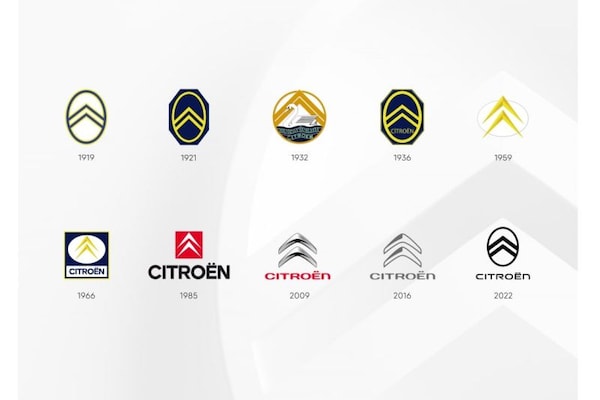
Citroën introduces a new logo for the ninth time in its more than 100 years of existence. The new logo goes hand in hand with a new ‘brand identity’, which the brand says is opening a new chapter.
The new Citroën logo is a simplified version of the well-known logo and harks back to the original logo of the brand. We see two simple and more 2D-like chevrons placed in an oval. The brand name is written below in sleek, modern typography. The new logo will soon debut on a new study model with which Citroën broadly shows the path it will take in the future. The brand already gives away that it will be a family car.
The new logos and revised typography are not only intended for cars, but also for all communication and marketing expressions of the brand. Therefore, expect the new house style in commercials and on the premises of the Citroën dealers. The new logos go hand in hand with a new slogan: ‘Nothing Moves Us Like Citroën’.
Citroen logos.
The last time Citroën changed its logo was in 2016. Then the brand introduced a simplified version of the logo presented in 2009. Citroën brand name was no longer written in red and the chevrons were given a more simplistic design, while still retaining the 3D effect. The chevrons are still a reference to the gears with herringbone teeth that Citroën founder André Citroën patented before Citroën was a car manufacturer.
.
– Thanks for information from Autoweek.nl