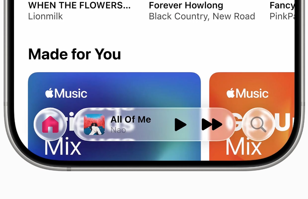
During WWDC 2025, the most attention went to Liquid Glass: the new design language for all Apple software. Beautiful, but a disaster for usability.
Liquid Glass: The glass is half full
During WWDC 2025, Apple presented something shiny to distract us from the fact that Siri is still oil. Liquid Glass is a new design language for all Apple software, where OS elements become transparent and everything gets a shiny edge.
Not only does every OS update now have the same figure to radiate more unity, but because of this universal design language it also looks like a real OS family that behaves in the same way everywhere.
With Liquid Glass, especially more flexibility is possible, which means that shapes and sizes of buttons and menus change due to the context. For example, menus can flow from a button, without being sent to a whole new menu screen. Just like water, the clock on the lock screen takes more space if possible. Yet it is not all good news.

Logical on a Vision Pro
Inspiration for Liquid Glass was met from Visionos, the operating system of the Vision Pro. If you wear such glasses it is important to be able to look through elements, because otherwise you will encounter something like that. On a screen that makes no sense at all.
With an iPhone or iPad, Liquid Glass feels more like there is a drop on the screen, so that the light is bent and the image in that place is distorting. The effect is visually impressive, but the ease of use takes a few big steps back.

For example, scrolling on a screen feels with Liquid Glass because of those unnecessary effects a lot more restless. Because the image under the button behaves differently than expecting your brain, your eyes are automatically pulled there. The readability is also deteriorating because everything happens behind the text and buttons with different colors and shapes.
That is especially visible at the iOS 26 control panel. The dark surfaces behind the buttons are now transparent, just like the buttons themselves. That looks enormously messy, if there is a busy app or wallpaper under the control panel. Apple has been tinkering with the various beta versions of iOS 26. But it still looks confused.
How Apple can make up for it
This kind of design choices usually goes in wave movements, from exuberantly stylized to practically minimalist. We are now going into the stylized phase, so that Apple may later come up with something such as ‘Frosted Glass’. In any case, the good news is that you can simply adjust the transparency in accessibility settings on every device. You just have to know that.
There is a way in which Apple can make up for it. Everything is forgiven if this design language is also implemented in the hardware. We have been yearning for years for the return of transparent devices, such as the iMac G4 from 1998. Give us a transparent iPhone, iMac and new Apple Watch, and then we take those shiny drops on the screen for granted. Agreed to meet?
More Apple news
Do you not want to miss an update and announcement from Apple? Then register for our newsletter, so that you will always stay informed!

Download the iPhoned app
