Niels van Roij about Nissan’s new electric SUV

In this design review, Niels van Roij assesses the Nissan Ariya. Is he as enthusiastic about this electric SUV as he is about the Renault Mégane E-tech Electric, which Niels discussed in a previous design review? First, the designer takes a moment to reflect on Nissan’s electric pioneer, the first Leaf, before going wild on the Ariya.
Nissan was there early with the Leaf in 2010: an affordable, electric five-seater car – although the design was exceptionally soporific and did not appeal to the imagination at all. Now the competition is awake. Kia, Hyundai, Mazda and Renault, among others, are making successful attempts to lift electric driving far above the dull Leaf level. How does the Ariya stand against these crushing rivals?
We can be brief about that: excellent. Nissan has dared to radically change the electric design helm. A fresh philosophy, based on the Japanese roots of the brand, has been applied. Nissan christened the results of the concept of Timeless Japanese Futurism. The design team has applied a series of Japanese keywords and concepts during the design and that has not been without results.
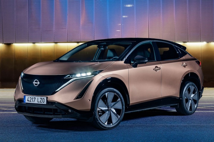
The Ariya is characterized by an SUV coupe A-line, which now characterizes many electric cars because of the excellent aerodynamic properties. The Ariya has athletic forms and has proportionately succeeded within this relatively new genre. The A-pillar dynamically moves backwards and merges into the C-pillar. The roofline thus created is accurately emphasized by the only piece brightwork applied to the Ariya: a satin finished, metallic element.

Nissan Ariya
The cab forward The position of the cab makes optimum use of the space within the wheelbase, while the black-painted roof on many versions lowers the visual center of gravity. The mudguard edges, like the lower bumper elements and skirts, are also painted in glossy black. Just like the black roof, they make the car look less heavy. The visual mass is removed from the bottom and top of the body, as the human eye mainly reads the lighter color of the body.
The wheels Nissan fitted to the Ariya are radically different from the Leaf, where they were painfully small. Compared to the Leaf, the car has a much more pleasant stance and a better ratio between body and wheels.

It is worth noting that the beltline under the hood and is therefore uniquely positioned low on the side. This line is clearly drawn down the shoulder to give the Ariya a wider glass surface. This makes the car look less threatening and aggressive, while passengers have a larger opening to look out.
Handles do aesthetic violence to flank
The simple, pure surfacing with sharply defined folds and a minimal amount of detail has been applied consistently to the car. Recessed handles, however, would have been in place. The skin on the side would have remained purer with this. The somewhat brash handles applied to the Ariya detonate and aesthetically do quite a bit of violence on the refined flank. Also, recessed ones are considerably more streamlined.

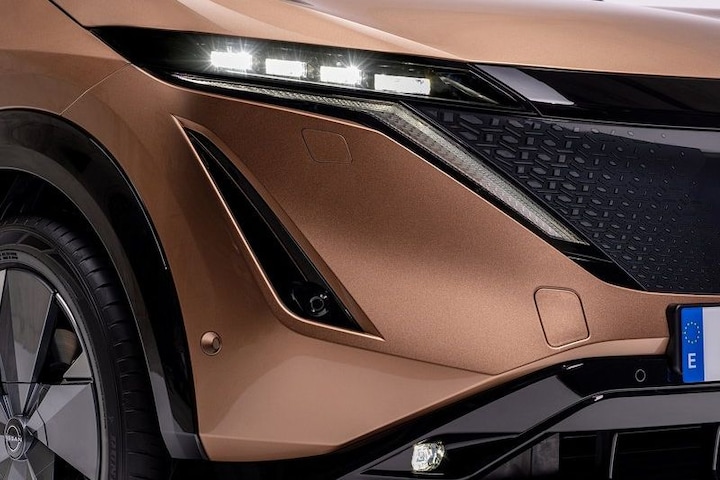
Ultra-thin LED headlights adorn the nose, with an illuminated V-motion signature enclosing the black graphic that houses various sensors and, of course, the Nissan emblem. As a graphical expression in the nose, this shield replaces the grille that would be on a fuel-powered vehicle.

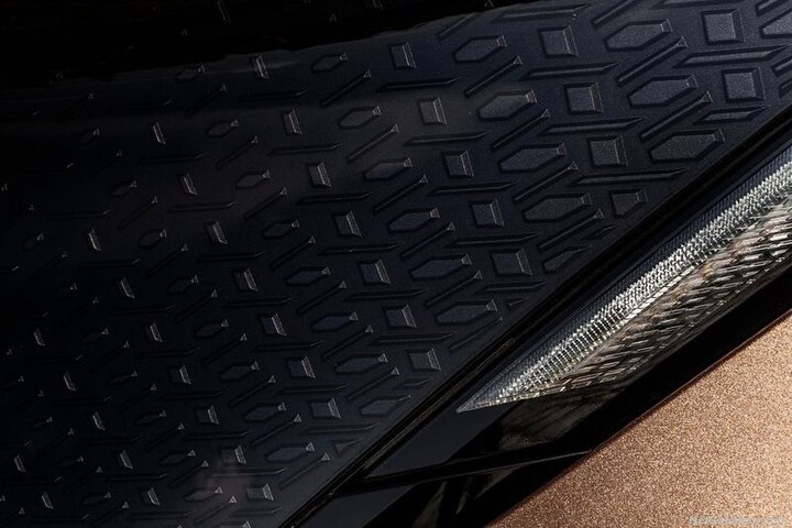
One of the previously mentioned Japanese concepts that the design team applied during the design process is Kumiko. This is a traditional Japanese technique found in woodworking. With this method, thinly cut wooden elements are engraved and mounted using a planer, saw or chisel – completely without nails or screws. The end result is a complex and often intricate pattern, which is mainly used in making shoji doors and screens.
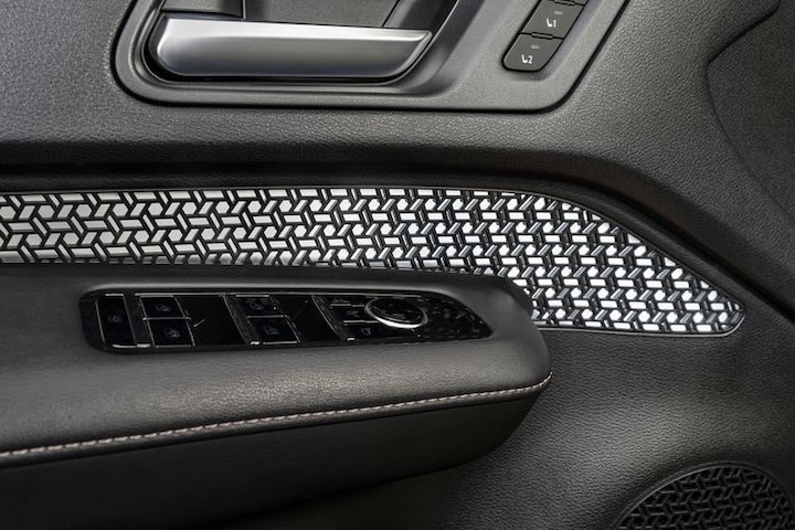
A specially designed three-dimensional Kumiko pattern can be seen in the nose, just below the smooth and translucent outer surface of the shield. Kumiko has also been used to envelop the glow of the headlights and is also reflected in the interior, where the design theme is softly illuminated by mood lighting. The Japanese DNA reflects quite literally in the Ariya design in this regard.

The precise and energetic shape of the Ariya is undeniably Japanese-style. A design that is honest about the special culture that the product has spawned and that looks many times more confident than the brand’s first forays into the electric vehicle segment. Time for the competitors to rub the last bit of sleep from their eyes.
.
– Thanks for information from Autoweek.nl