Niels van Roij sees successful comeback

The chance that you will encounter the Renault Megane E-tech Electric on the road is increasing by the day. After all, the electric hatchback has just hit the market. In episode three of the design review by designer Niels van Roij, the new, electric Megane (indeed, from now on without an accent on the ‘e’) is the main subject.
At the end of the first decade of the 21st century, things are not going smoothly at Renault. What is called: it is the end of 2008 crisis at the French car manufacturer. The entire range – from Laguna to Kangoo, Mégane to Twingo, Laguna Coupé to Fluence and Clio to Scenic – consists of cars with a design style that does not catch on. The models are visually heavy with awkward proportions, have wheels that are way too small and have meaningless surfacing. The zest for life is equally hard to find at the Renault dealers, because a true customer exodus is underway.
Laurens van den Acker
Laurens van den Acker takes over as chief designer at the ailing Renault in 2009. The brand is not only looking for a stronger identity, but also for the essential sales boost. Little empathy is needed to feel the pressure on the shoulders of the brand new design chief. Because how does the brand get back on the map? How can the design team translate Renault’s values into market-relevant products?
Renault is being revitalized through a design strategy centered around the symbolism of the life cycle – love, exploration, family, work, leisure and wisdom. Arranged in a flower shape, the various stages follow each other, each presented in a relevant color. This is how Van den Acker outlines the journey that people – and therefore the extremely wide customer base that specifically serves Renault – go through in life.
 But Laurens is of course not there with only a good philosophy on paper. An emotional design DNA is devised. A spectrum of shapes that makes it possible to identify a Renault model as such at a glance. The new stylistic language is sensual, Latin and colourful. To emphasize the sensuality, the designers are no longer allowed to draw lines: an elegant body does not consist of lines, only color areas of light and shadow define shape.
 The new design strategy comes to life visually through a series of concept cars: DeZir, Captur, R-Space, Frendzy, Twin’Run and Initiale Paris, presented in the bold colors of the life cycle flower. The concept cars are not only an important exercise for the design team, but also a direct harbinger of the future models. The ideas also appear to be perfectly translatable to production models, such as the Clio and Captur. Renault is selling cars again. And how!
For the successive models, Renault must continue to do what works well – right? If only it were that simple. The fact that beautiful cars don’t sell automatically shows the law of the braking lead, clearly illustrated in the car world by the Jaguar XJ. Many thought it was beautiful, but people stepped into the A8, S-class and 7-series en masse. And now the XJ is no more.
Megane E-Tech Electric not a revolution
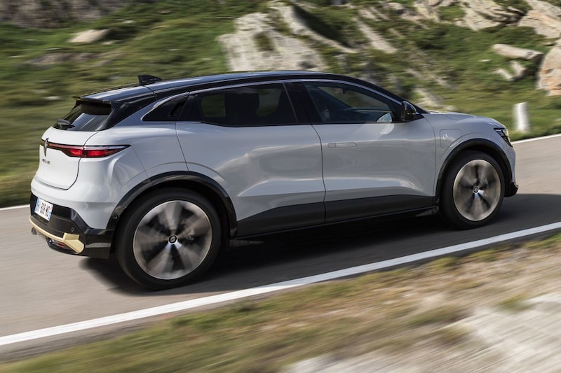
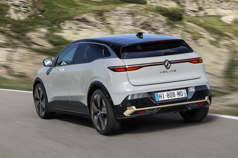
The Megane E-Tech Electric is clearly an evolution, not a revolution, of the design language introduced by Van den Acker. The soft, creamy Renault shapes, however, have been given sharp edges in this iteration. The car is proportionate: Van den Acker has once again succeeded in pushing large wheels through the production process. These are essential for the good stance of the Megane E-Tech – it stands sturdy on its legs – but they are cut short by many brands due to high costs.

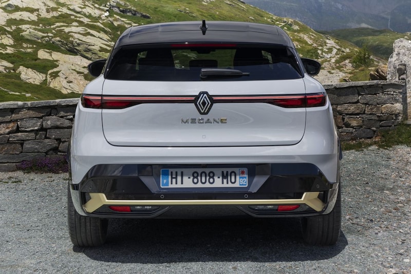
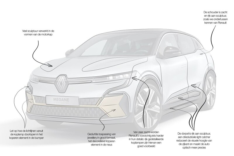
The Renault Megane E-Tech Electric has a lot of sculpture, for example in the hood shapes. Closer, we see a lot of sculpture in the skin, for example in the hood shapes. Also note how the light lines in the headlight continue into the copper element in the bumper. An interesting way to make the interplay of proportions, surfacing and jewelery even more consistent. The bold application of large-format jewelery is the decorative copper element in the nose. The unit also illustrates the evolution of the design language from creamy to harder, especially in details. The richly detailed headlights are also a typical example of this.

On the side, the highly sculptural sill catches the eye. This is special, because electric cars in particular now have as flat a side as possible. That helps a lot with the aerodynamics, but much less with the looks… The triple light catcher on the side reduces the visual height of the Megane E-Tech Electric. It also makes the car optically more precise due to the sharp changes in direction in the surfacing. Above it we find a broad shoulder: soft and again rich in sculpture.
From half-hearted without sjeu to French joie de vivre
It is almost impossible to find a brand that has had a more successful comeback than Renault. From half-hearted designs without a fuss to French joie de vivre with a strong identity. The design team then continued: the brand not only came back on the map, but will remain there for the time being due to critical adjustments. Good luck!
.
– Thanks for information from Autoweek.nl