Subtly modernized

Just when you thought the series of logo innovations of recent years was complete, Lamborghini came up with a new logo.
In recent years, numerous brands have presented new logos. Often they are simplified, more ‘2D’-like representations of the earlier decals. Sometimes it goes further, such as with Peugeot and Citroën, which hark back to logos from a distant past. Lamborghini is now joining the innovation party and opting for the first approach.

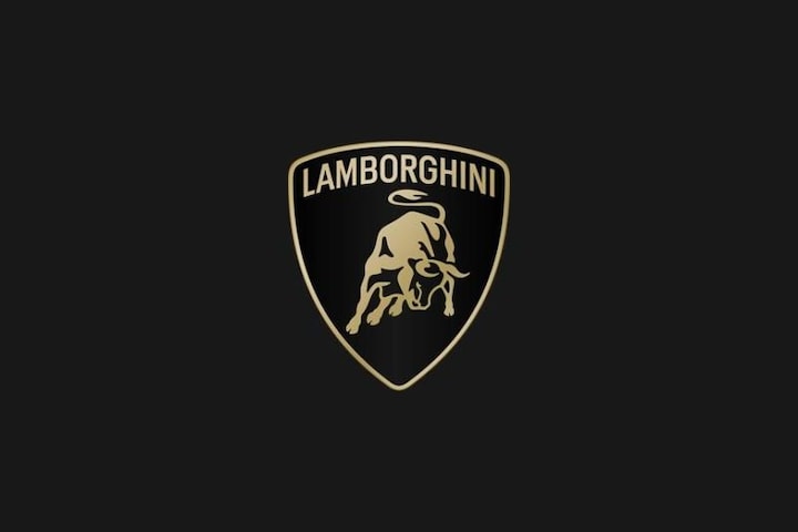
Lamborghini’s new logo.
We see the well-known emblem of the Italian sports car brand, but in a somewhat simplified and ‘flatter’ representation. The bull is now a further simplified vector drawing and all drawn reflections have disappeared from the logo. The originally gold accents are now somewhat paler in color. It is not yet clear when the new logo will appear on the cars.
– Thanks for information from Autoweek.nl