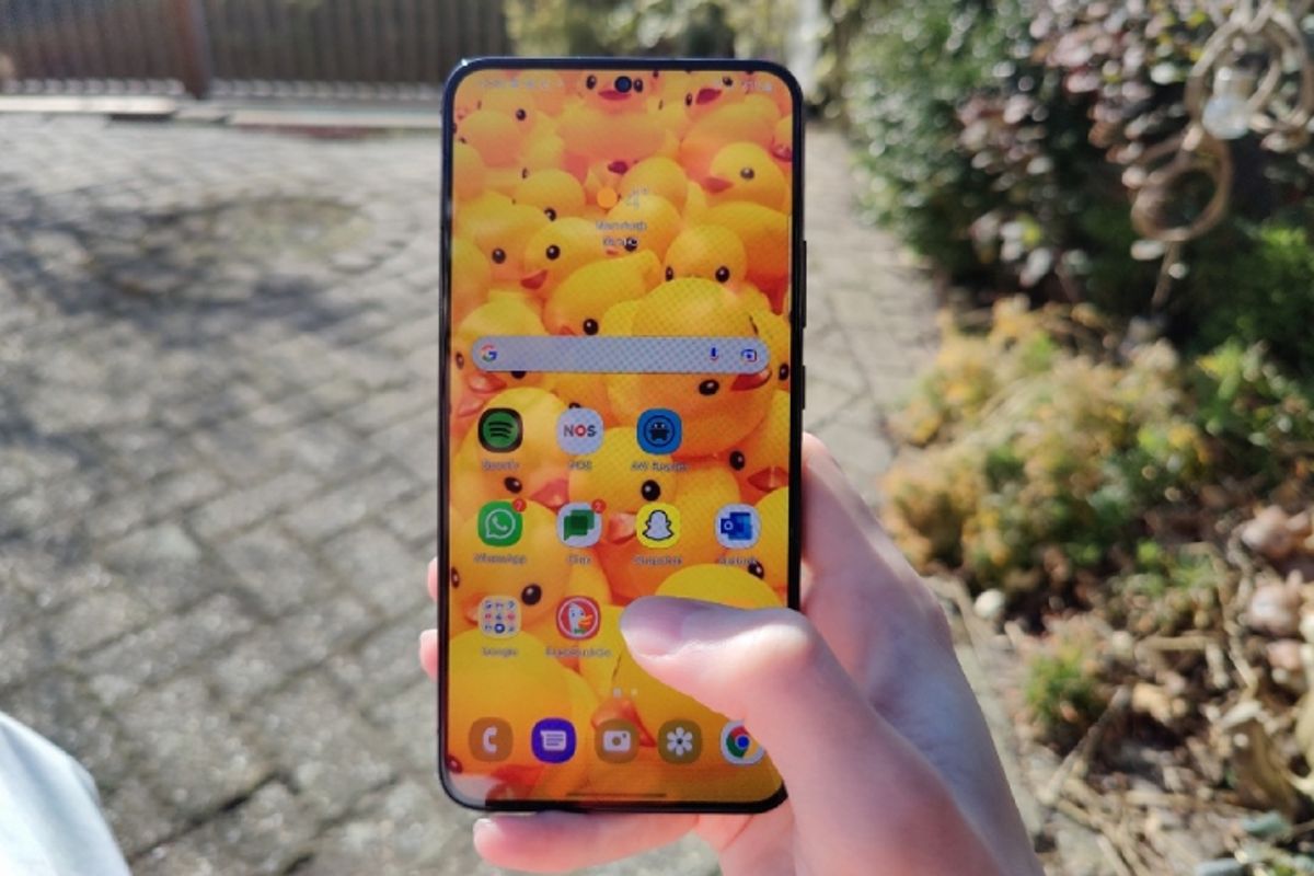
Samsung’s Android shell One UI 5.0 is almost coming and it shows. The design promises to be softer, as newly leaked screenshots show. The beta update will come as early as the third week of July.
OneUI 5.0
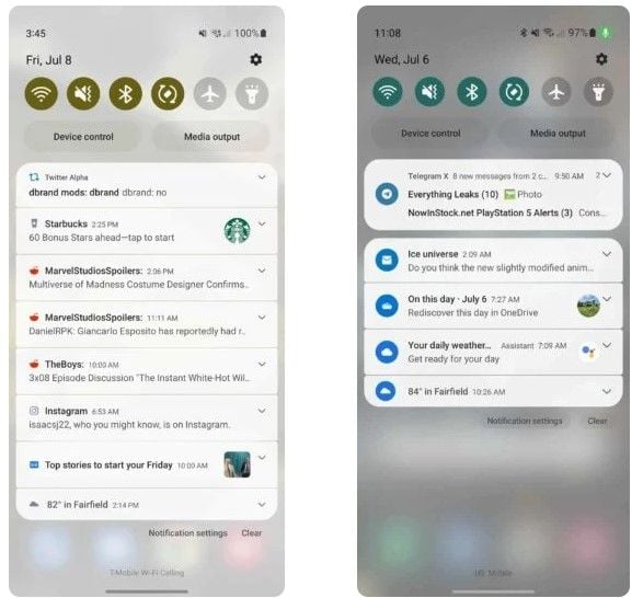
In the upgrade of One UI 4.0, more animations promise to come, in addition to probably a big boost in speed. However, now we’ve seen more on screenshots shared by 9to5Google† † In this we see, among other things, adjustments to the notification screen with larger icons, in addition to a different background color.
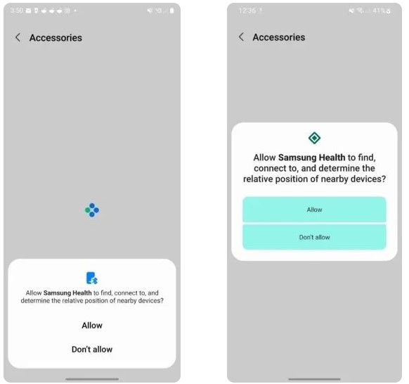
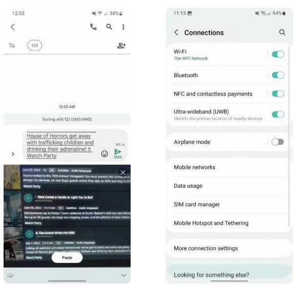
Furthermore, we see in the pop-up about app permissions that it has moved from the bottom to the middle of the screen and is designed more towards Android 13. In addition, the UWB (Ultra-Wideband) option can be seen in the connections screen, which has everything to do with the new way of paying via ING.
Samsung
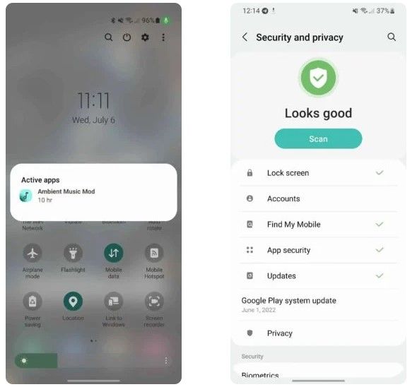
The Gallery app also gets something new. This includes optical character recognition, with which the app can extract text from images for easier processing. We also see them in the Samsung keyboard app. In addition, the security and privacy hub also looks much more streamlined.
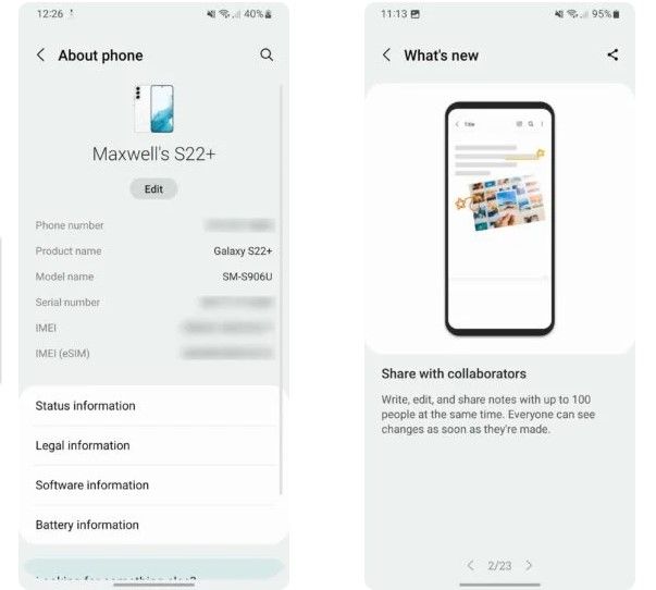
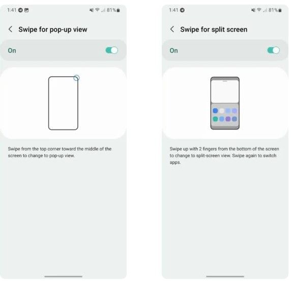
You will see more options and these are listed, including the ‘Find My’ option and the system updates from Google Play. Two new gestures have also been added within Lab: swiping for striker screen. There is also an integration with Samsung Notes, allowing you to share your notes with 100 other users.
So many novelties, although especially the appearance has been considerably polished. This makes it a bit quieter, while it does ‘borrow’ all kinds of external features from Android 13. It is good to take into account that it is still a beta variant, so the screenshots through this article are not definitive.
Those were the screenshots. What do you think of the new look of Samsung One UI 5.0?
– Thanks for information from Androidworld. Source