It was not until 1966 that the Netherlands and Belgium became acquainted with Nissan, which at the time still built cars under the Datsun name. But the brand is much older and behind the Nissan logo is – entirely in Japanese tradition – a lot of symbolism.

Tourists in Japan are quick to do something wrong. There are so many unwritten rules and pleasantries that you can go through the sakura soon loses sight of the forest. Even actions that you normally don’t think about will cost you a headache. It’s a good thing that business cards are hardly exchanged anymore thanks to digitization, because in Japan that is very close. You grab it with both hands, then read it very extensively and then put the card in the left inner pocket of your jacket. Close to your heart. Handling it with one hand is already rude, and putting the card carelessly in your wallet or – Japanese gets roller-stroke – stuffing your back pocket is completely out of the question.
On the other hand, there is a lot of nice things: no ball on the floor, no Takuhai scooter (Delivered at Home) that you drive off your socks, no bicycle that is locked, no person in front of you. But to penetrate the Japanese soul? Meh. A story about a logo of a Japanese brand quickly acquires the symbolism that we sober Dutch associate with the Happinez. The same goes for Nissan. The rising sun, symbol of Japan, breaks through regularly.

What is the difference between Datsun and Nissan?
First let’s talk about the difference between Datsun and Nissan. Datsun already made cars in the 1920s and was initially called DAT, a combination of the names of founders Den, Aoyama and Takeuchi. Later it became Datson. Son means son, but also loss. And so in 1931 the name was changed to Datsun – where sun refers to the sun. After various mergers, Datsun became part of the Nissan Motor Company, founded in 1934. It was not until 1966 that the Netherlands and Belgium became acquainted with the brand. Until 1984 all cars for export are marketed as Datsun.

The rising sun is also in the Nissan logo
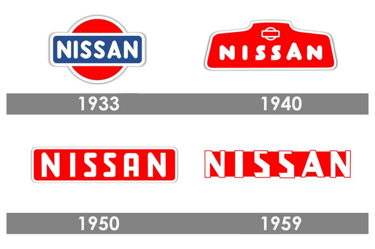
The sun is also omnipresent at Nissan. Nissan can be freely translated as Product of the Sun or Birth of the Sun. But there’s something else behind it. One of Nissan’s core values is “Shisei tenjitsu o tsuranuku”. That means freely translated “If you really believe in something, it even penetrates the sun”. The first logo was adopted from Datsun in 1934 and consisted of a blue rectangle with the company name in capitals on it, behind it the rising red sun.

Datsun and Nissan logos changed often
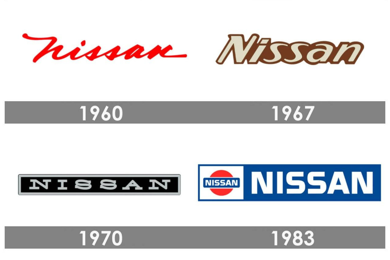
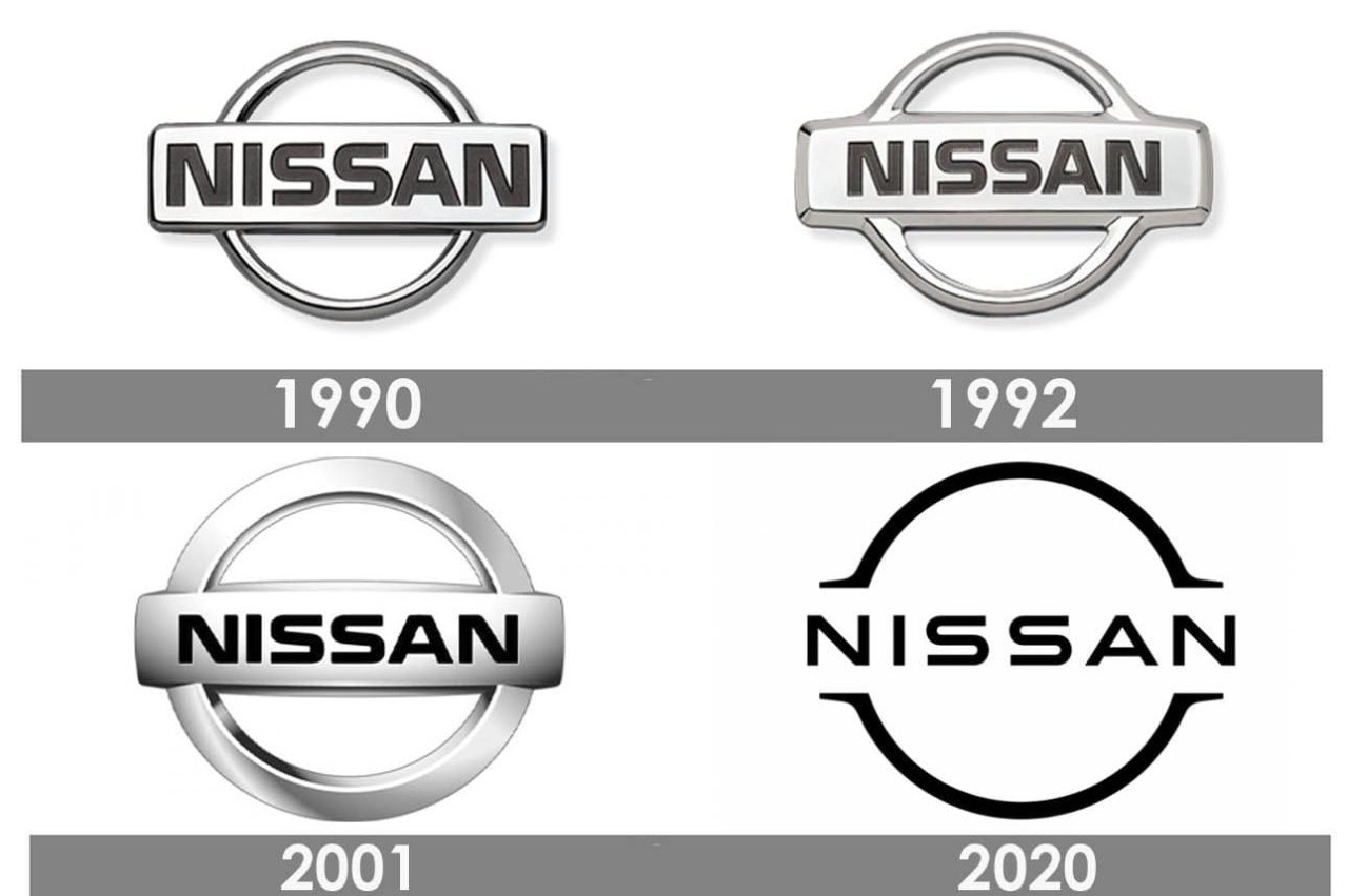
The Datsun and Nissan logos were frequently changed in the 1950s, 1960s and 1970s. In 1986 things become clear: the Datsun name disappears (in Europe and North America this had already happened two years earlier) and all Nissan cars get the same emblem. That’s almost identical to the old logo from the 1930s: blue rectangle, white letters, rising sun behind it. In 1990, blue and red give way to gray, but the contours remain the same. The last update will come in 2020: completely in line with fashion, Nissan now has a two-dimensional logo. Two thin lines symbolize the sun, in the middle the word Nissan is written in slender letters.