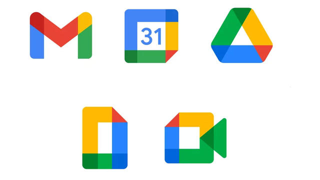
All change is good, all change is difficult. However you look at it, opinions are divided over the new icons of the most popular Google services, including Gmail and Drive. Recently, Google introduced that new look, which you don’t have to deal with when you install this Chrome extension.
The changes that have now been made to the Google icons were already announced in October. But even then it is probably going too fast for many users. It is also true that those icons have changed in several places: on the web, but also on your phone, for example. You can adjust the icon on your smartphone to something you like, such as the old work of the search engine giant. But on the web it is usually a bit more difficult. That is why it is nice to see that there are people who think about this and also do something about it.
Bring those old Google icons back to Chrome
Designer Claudio Postinghel is one of the people who will enable you to reverse the changes. But before we get there, it is important to know why Google made those changes. Not only did the company do this to be able to compete better with Microsoft, there is also now more cohesion between the various services. If that is more your thing, then you can of course just leave everything as it is. If you don’t give a damn about that, we’re now finally going to talk about the extension that you can download for this.

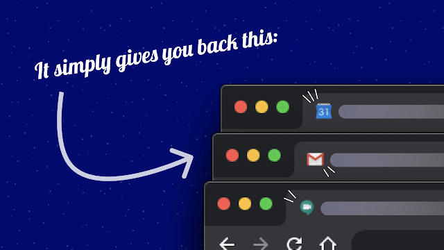
If you now go to the website from the designer, you will encounter two links there: one for Google Chrome and one for Firefox. The version for Firefox is not yet available, but will be coming soon. After downloading and installing the Chrome extension, you will soon come to the conclusion that it does exactly what is advertised: all customized icons are returned to the old state. In the comments on the Web Store page you can see that a lot of people are happy with this, because they just like the old icons more beautiful.
Because let’s be honest for a moment: the new icons are not really an improvement. Glad they have the same style now; but when you have several tabs open with different Google services, it is difficult to quickly find out which tab you should have exactly. Moreover, people who are color blind are probably also having a harder time now. So it’s not just about disagreeing with a new design. The user-friendliness of the various Google services has also deteriorated.
.