Niels van Roij lacks brand DNA

The stylistic quality of Volkswagen design work has been subject to intense turbulence for some years now. With the latest ID iteration in the form of the 7, according to car designer Niels van Roij, this leads to the question of how we should judge the flying work of the current VW design.
None other than the Italian high flyer Giorgetto Giugiaro invented the modern Volkswagen design in the 1970s. Prior to hiring its services, VW had utterly failed to modernize the design language that once established the Volkswagen Beetle.
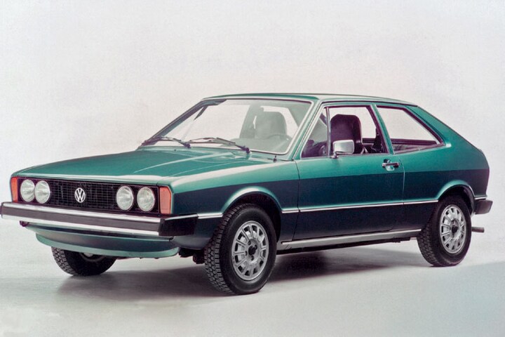
Giugiaro’s designs of the Golf, Passat and Scirocco combined the prevailing stylistic trends of the 1970s, of clean surfacing and proportion, with the Giugiaro touch and Teutonic austerity. With the afterburner on, these cars made up for 20 years of stylistic stagnation in one fell swoop. They immediately provided a coherent design language for the then ailing German manufacturer.
(text continues after photos)


Despite this great success, Giugiaro was not asked again when it was time to replace these models. Instead, VW wanted to set up its own design department in Wolfsburg. The substantial Golf II was less delicate in its surfacing and its main purpose was to convey a sense of solidity. A sturdy stylistic air pocket in flight upwards.

Automotive legend Ferdinand Piëch arrived in Wolfsburg in 1993 and, as described in the ID2all review, put an end to the clumsy and simplistic details. The new chief designer he brought along replaced the old design ideas with a technical, clean design language that visualized superior quality. It would become the Concordes of car design work, which came about in this era. From the up-market Golf IV, to the Passat, New Beetle and the Audi TT, A8, and various Seat and Skoda products.
(Text continues after photos, red sports car is W12 study from 1997)


Fasten your seatbelts: because the exceptional refinement was completely shattered when Murat Günak replaced clinical precision and quality with ostentatious chrome decorum on a series of concept and production cars, which were also afflicted with horribly poor proportions. In particular, the ostentatious Plaque grill – a clunky chrome-plated unit intended to add class to the front, but mostly reminiscent of BA Baracus’s tinsel – damaged Volkswagen’s stylistic values.
(Text continues after photos of Concept C, the precursor of the Eos, and the Concept R, a study for a roadster that never went into production)


Volkswagen Concept R.


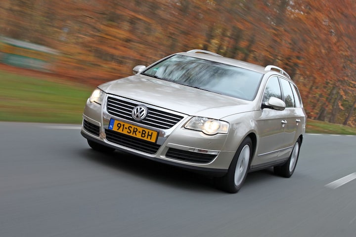
Volkswagen Passat.
Later, Walter de’ Silva got the whole thing back on course. With, among other things, the Volkswagen Up as a true design highlight.
Volkswagen ID7 has too small wheels
The ID range is a jumbo-sized VW production offensive, which is stylistically consistent. That is immediately the only positive aspect. Because unfortunately it is consistently bad. Executed in even worse proportions than the Günak Volkswagens, with squeezing graphics and frighteningly weak-looking surfacing that apparently makes the powerful Giugiaro and de’ Silva form ideas forget. The ID7 has wheels that are too small, a wheelbase that is too long, too much visual weight over the front wheel, an unsightly roofline and sinking, flat surfacing.
Historically, Volkswagen design has always been at its best when designers have a deep understanding of the essence of the brand DNA. At the moment, the design team at Volkswagen clearly lacks focus and direction from the design captain. The result is a heady course, an unclear vision of brand values and only more turbulence.
.
– Thanks for information from Autoweek.nl