Fine grinding shop


Over the past few years, several car manufacturers have revamped their logos. Now Aston Martin is also adapting its emblem. Aston Martin immediately introduces a new slogan: Intensity. driven.
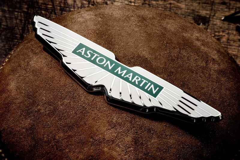
Aston Martin presents a modernized logo, but we can’t blame you if you don’t immediately see the differences with the existing logo. Aston Martin removes the semicircle connecting the two wings of the logo and adapts the font of its brand name written in a rectangle. The refreshed decal was designed by British graphic designer Peter Saville.
With its new slogan ‘intensity. Driven.’ Aston Martin says it wants to emphasize that it is a manufacturer that builds luxury and sporty cars. The brand indicates that it wants to appeal to a larger audience. The new logo will debut on Aston Martin’s next range of models.
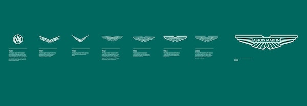
The Aston Martin logo has been dramatically modernized since 1920. Where the emblem initially consisted of a circle containing the letters A and M, Aston Martin wrote its brand name in full from 1927. Wings were formed from the letters T and M, which, after the introduction of a smoothed-out variant of the logo in 1930, eventually evolved in 1932 into a logo that differs from the current one only in details.
.
– Thanks for information from Autoweek.nl