Niels van Roij enthusiastic about second generation Kona

Hyundai recently unveiled the second-generation Kona. The successor to the compact SUV that, in its first form, although quirky, but also quite forced and even looked unpleasant. According to car designer Niels van Roij, the Koreans have the shape palette of this second batch in order considerably better.
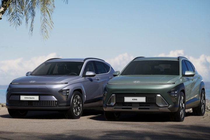
The new model has grown on all sides and will soon be available as an EV, hybrid, combustion engine and in sporty N Line variants. Hyundai has assigned each of these four relevant, unique styling. Well done!

The new Hyundai Kona has a better stance.
The proportional statement, compared to the first Kona, has remained virtually unchanged despite the increased outer dimensions. Smart, because the car looks better due to its large dimensions, because there is literally more room for shape. Larger wheels housed in wider hips are set further out and improve the stance significantly compared to the outgoing model. Existing Kona customers feel known for design evolution rather than revolution. Because of this, it is likely that they will consider switching to the new Kona. If Hyundai had initiated a radical change of course, it would certainly have been less obvious.

Striking nose
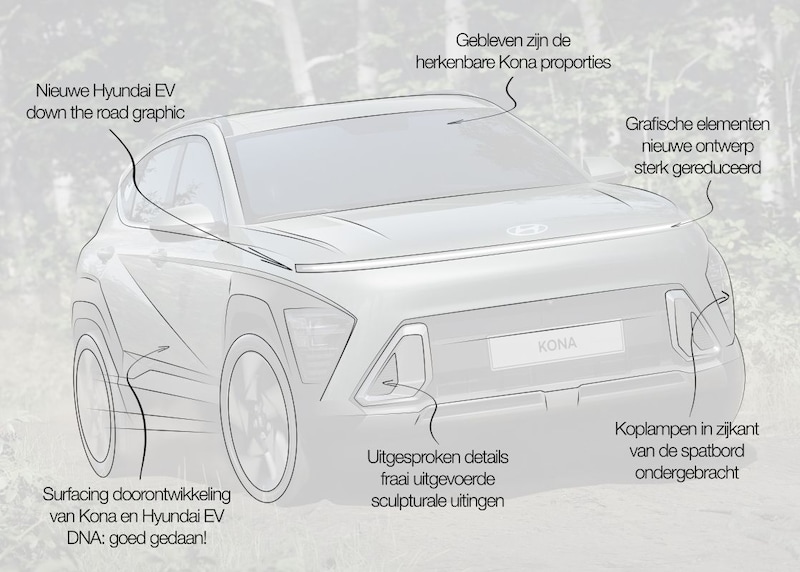
The striking nose of the new Kona is clearly based on the aesthetics and form language of the previous model, but has been significantly minimized and drawn more purely. The clean nose volume contributes to aerodynamic performance. The appearance is also better than the messy first Kona. The graphics we know from its predecessor of the lighting housed in the side of the wheel arch trim. In the new model this is recognizable down the road graphics much better integrated. The fender flares with lamps enhance the recognizable Hyundai face on the one hand and the SUV characteristics desired by customers on the other.

Different fronts for the new Hyundai Kona. That was also the case with the first model series.
Lower in the nose are two fresh elements for the Kona recipe: large metallic air intakes. A fresh expression of jewellery is the Seamless Horizon Lamp, which runs the full width of the nose and is pixelated on the EV variant. This form has not been used before. The back has a similar design with a horizontal lamp unit.
Light catchers
Well executed light catchers are consistently incorporated into the body on the sills, under the nose and on the pronounced outlines of the fender flares. The shutlines are more integral to the design in the second generation, including the subtle ones clamshell bonnet.
Linked to the design of the Ioniq 5 and Ioniq 6 is the surfacing of the Kona in parametric surfaces – a hard, geometrically sculpted skin. The sharp diagonal characterline on the flank, the satin chrome strip connects the shoulder line with the spoiler. This contour wraps around the car.

Design team gets a lot of freedom
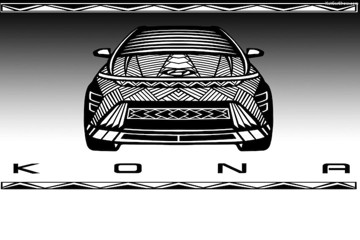
The unique character of the first Kona has been continued in the second model and has evolved considerably at the same time. The newcomer looks significantly better, without sacrificing the bold cachet that was so characteristic of the first Kona. The refreshing design is also clearly linked to the DNA of the now almost iconic Ioniq 5 and Ioniq 6 EVs. The new Kona is a highly successful design exercise with the right balance between evolution and revolution. The sublime, varied sketches illustrate that Hyundai takes its design work very seriously and also gives the team a lot of freedom. This results in equally wonderful sales figures.
.
– Thanks for information from Autoweek.nl