Niels van Roij lacks focus and consistency with this Chinese brand

The latest generation MG is a model for the biggest malaise in the automotive industry: mismanagement in design. To the untrained eye, the new MG 4 may look similar to other Chinese EV SUVs. The truth is different, says car designer Niels van Roij.
The Chinese auto industry is young. Nevertheless, in the past 20 years they have managed to grow from a plagiarism factory to a leading party. An unprecedented achievement of the fast-growing local car industry. In that short time they have done excellent strategic planning and also brought stylistic gems into the world. Think of the range of Polestar, Lynk & Co and Nio models: design craftsmanship of the highest order. Made of strong brand DNAs to skilful proportions, unique surfacing and delicate jewelery design details.
No design focus at MG
Intriguingly, MG is part of a large group, the Chinese state car manufacturer SAIC Motor. Such companies often have generous design talent on board. Regularly bought away from European brands with big money, after they had earned their spurs there. Although MG communicates its English roots in all kinds of ways, there is clearly no design-technical focus.
No consistency, not even with the MG 4
Typical of old-fashioned Chinese companies is the highly hierarchical management structure. Within this, everyone wants to emphasize their effectiveness by putting a personal stamp on the design. Ultimately, it causes a lot of noise during the process and an unclear message from the end product: a cacophony of shapes, ideas, colors and materials. This problem does not seem to only apply to the 4 for MG. There has been no consistency in the model range for years.
(text continues after photos of MG 5, MG ZS EV, MG Marvel R, MG EHS, MG GS respectively)


The MG 4 is the metal gone design evil
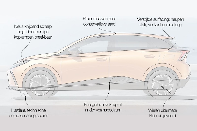
The 4 has become the metal design evil. The proportions of the MG are very conservative, the wheels are extremely small and the wheelbase is too long. Then the timid surfacing limps on various thoughts. The nose is squeezingly sharp and looks fragile due to the pointy headlights. At the bottom of the spoiler we see a harder, more technical skin setup. The detailing there is somewhat shrouded in mystery by the black plastics, but is more interesting and innovative than the shape spectrum of the painted body parts.

From the delicate-looking nose towards the flank, the skin remains sharp. The surfacing runs in a pinched line over the front door. In the sill below we see an energyless one kick up which seems to come from an entirely different, limp, form spectrum. A mismatch with both the pointed nose and the sturdy black front spoiler. Towards the back door, the surfacing suddenly stiffens. The hips become flatter, squarer and end in a woodenly stylized light bar.


As a feat, MG sprays the body in cheap, uncivilized colors. The hard and poisonous orange of the press photos does not do the car any good. This only increases the aesthetic noise and makes the 4 look clumsier and cheaper.
MG 4 is mismanagement in design
MG builds technically excellent cars, which are blessed with a high-quality finish. The 4 has a decent range for a reasonable price. But it lacks both a correct basic idea – the why – and a satisfactory execution – the how. Mismanagement in design on all facets. That lack of design vision is baffling in the face of the ever-forward-looking Chinese. If history has taught us anything, it’s that such impotent brands don’t last long. Not on the demanding European market, but also not on the equally choosy domestic market.
.
– Thanks for information from Autoweek.nl