I don’t speak Chinese, do I?

Chinese is considered one of the most difficult languages in the world. This poses the question for every new brand from that country: how do you pronounce it? We found out for you how to do that.
At birthday parties and at the coffee machine, cars are often discussed and then it is nice that you know how to pronounce the brand. That may seem like a piece of cake, but many self-proclaimed car experts were mercilessly misled by pronouncing Lamborghini as ‘Lambordzhini’. With all those new brands from a country with a language that most Westerners don’t even know a word of, it becomes quite difficult. To help you safeguard your sense of honor, we explain here how these Chinese brands should be pronounced. And since we’re at it, we’ll immediately explain the names and logos. So that you will soon impress everyone when it comes to cars.
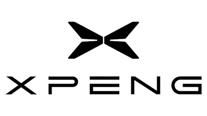
XPeng
XPeng comes from Xiaopeng Motors, which is named after its founder, He Xiaopeng. The origin of the logo – it will not surprise you – is the first letter of the brand name. You pronounce it as si-jau-pang.
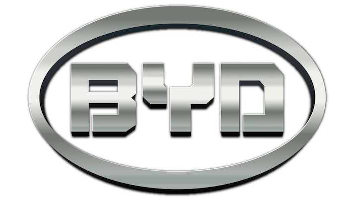
BYD
Most people know by now that BYD is the abbreviation for Build Your Dream. But where does that come from? After all, they don’t make dreams (unless you think about romantic lithium-ion cells every night). No, BYD is pinyin – a phonetic translation key that converts Mandarin into our script – for Biyadi, the name of the umbrella company Yadi Electronics, which in turn is named after Yadi Road in Dapeng New District, where it all started. They have set the Bi to move up in alphabetical lists. You just pronounce it in English, ‘bie waai die’, but adding a Chinese accent is of course always fun. The logo speaks for itself.
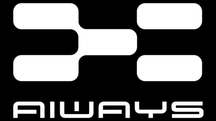
Aiways
Ai is Chinese for love and, as the name promises, it is on the way. The Aiways logo – pronounced: aj-weez – appears to consist of two parts that can slide neatly into each other, but the idea behind it remains a guess; there was no way we could get it out of the water. We do know from previous conversations with the people behind Nio that they attach great importance to autonomous driving and connectivity, so perhaps the interlocking blocks refer to the latter.
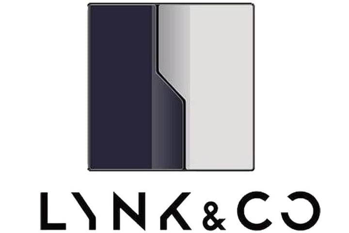
Lynk & Co
Lynk & Co targets a young, progressive audience and because nowadays everything is linked and works together (co-operate), the cars are called Lynk & Co. The statement speaks for itself and the logo also needs little explanation, although it is noticeable that the Y, the K and the O look like chocolate letters on December 6. At Lynk & Co, they find the drawing above stylish and minimalist and these are core values for the design of the cars.
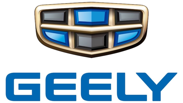
Geely
Is it ‘Dzjielie’ or ‘Gielie’ (with soft G), is a question that occupied the editors for a long time. The undersigned asked a local during a trip to China and guess what? In China they say ‘Kielie’. With a hard K. In pinyin it is Jílì, which is Chinese for auspicious or auspicious. The shield-shaped logo, divided into six black and blue areas in a golden framework, must radiate luxury, quality and superiority.
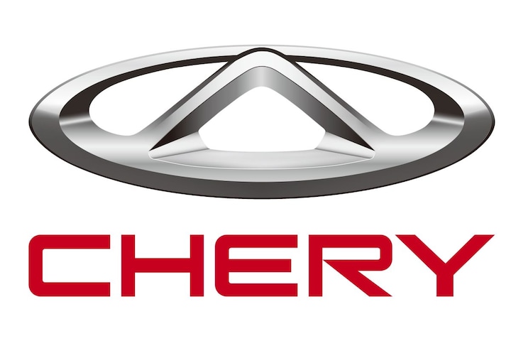
Chery
Chery’s logo depicts the letter A, which stands for Auto. The oval around it should give the logo more ‘stance’. The statement is no surprise: Cherrie. Chery is coming to Europe this year, but under no fewer than three different names. Omoda: the O stands for oxygen and vitality, ‘moda’ for fashionable, modern. Exlantix is a reference to Atlantis, the mythical, utopian society that was swallowed up by the ocean. Finally, Jaecoo is a loose amalgamation of the German word ‘Jäger’ and the English cool.
Hongqi
Hongqi is Chinese for red flag and they love it in the communist people’s republic. It is not without reason that Hongqi – the oldest passenger car brand and fully state-owned – is a supplier of government limousines. And admit it, the model with which they are trying to gain a foothold in our country, the E-HS9, looks like you wouldn’t get a scratch on it with five tanks and an atomic bomb. You pronounce it as ‘hong tsi’.
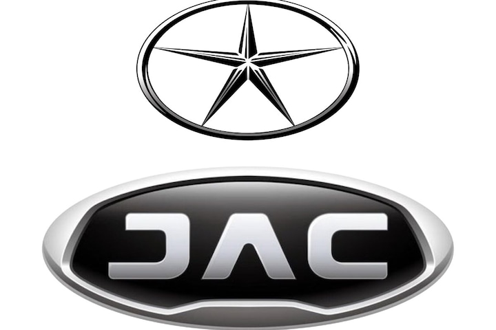
JAC
JAC – simply pronounced ‘jak’ – is the abbreviation of Anhui Jianghuai Automobile Group Corp., where Jianghuai is the region and Anhui the province where the brand was born in the 1960s. There are no exciting stories to tell about the logo. The A without a crossbar and the J and C as symmetrically as possible should give JAC, which was previously adorned with a five-pointed star, a modern and high-tech appearance.
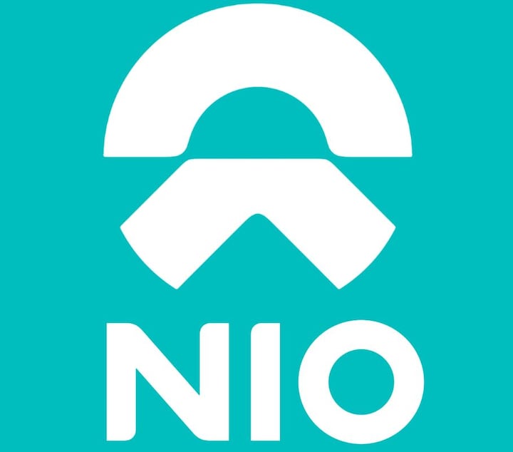
Nio
Nio wants to do things a little differently with interchangeable batteries and showrooms disguised as living rooms and likes to see itself as a creator of the future, which is weìlái in Chinese. That doesn’t sit well with us, so it was refined to Nio, the pronunciation of which speaks for itself. The semicircle represents the sky, which represents a vision of the future. The lower part represents the Earth, moving forward, towards the horizon.
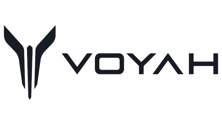
Voyah
The name Voyah was invented for us (in China it is Lán Tú) and should give you the feeling that you are embarking on a luxurious journey where you transcend ordinary life. This needs some underlining, because parent company Dongfeng is more of the cheaper cars and commercial vehicles, while Voyah is called premium. Voyah can be pronounced like the French word for journey, but with the last syllable removed. Although the brand only delivered its first car in 2020, Desireless already sang about it in 1986… The logo is at least as high-flown: here we see the mythical creature K’yun P’yun, a fish that rises from the ocean, in a bird changes and then carries the entire firmament on its shoulders. Who said the opium problem in China is a thing of the past?
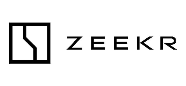
Zeekr
Zeekr is derived from the Chinese word Jí kè. That means krypton, a noble gas that emits light under the influence of electricity. At the same time, the Z stands for generation Z, the successors of the millennials, generation Y. The brand is aiming for the next generation. Which, by the way, does give it the opposite effect as the B that BYD came up with. No need to break your tongue on it, you pronounce it ‘zeeker’.
– Thanks for information from Autoweek.nl