

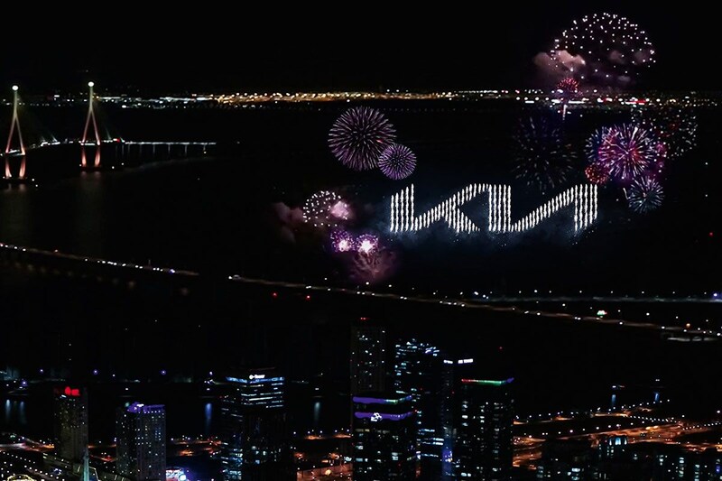
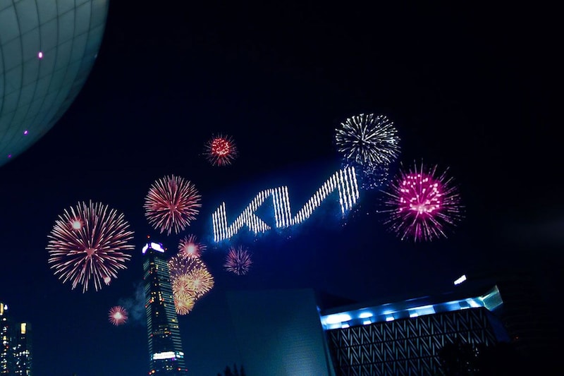

One after another car manufacturer launches a revised version of its logo and this time it is Kia that launches its new logo. The presentation goes hand in hand with the arrival of a different slogan and a brand strategy that promises a significant change of course.
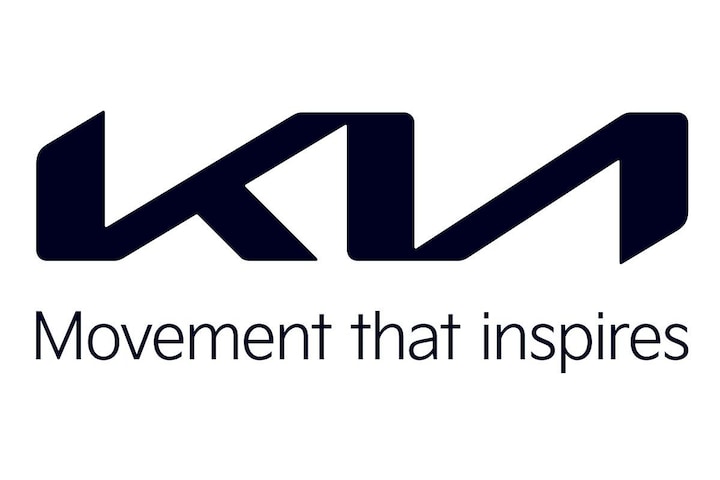
In February last year, Techzle got wind of the arrival of a new logo for Kia. Today the brand has presented its logo along with a new brand slogan. The latest Kia logo is, just like the recently changed logos of Opel and BMW, among others, tightened and looks more minimalist than before.
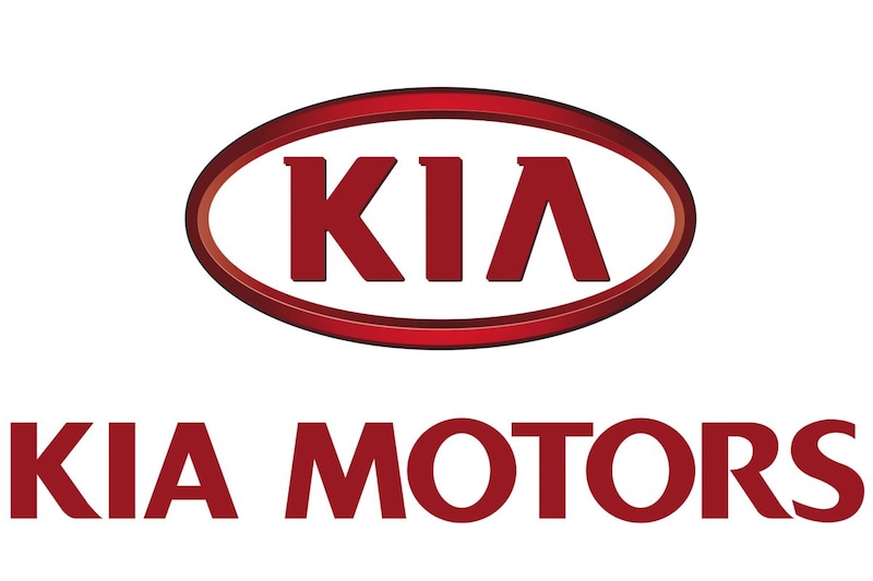
The modified logo is accompanied by a new Kia brand slogan: ‘Movement that inspires’. According to Kia, the 2021 emblem better fits the products and services that the brand will offer in the coming years. The logo, which somewhat looks like it was written by hand, is no longer in red, but in black. “The automotive industry is changing rapidly and Kia is working hard on new mobility concepts,” said CEO Ho Sung Song. “The new logo reflects our commitment to continue to inspire customers as their mobility needs evolve and, for our team, is the face of the bold way we meet the challenges in our industry.”
And that’s not all. Kia has drastically overhauled the brand strategy, which it will publish later this week. Kia promises to shed light on its future products and services very soon. The new ‘Plan S’ strategy, as the policy plan is called and of which the S stands for ‘Shift’ (shift / change), will be explained next week. We already know that Kia wants to “make electric driving accessible on a large scale” and that the brand presents “new forms of mobility”. More later!
Parent company Hyundai Motors is increasingly focusing on electric cars. For example, the company has come up with a brand that will focus entirely on electric cars: Ioniq. You can read more about this here. Ioniq’s first-born will be the 5, an electric crossover-style hatchback that is the production version of the Hyundai 45 Concept.