Opel has officially unveiled its new logo and also presents a new ‘brand identity’. We saw the emblem before, but the ‘brand color’ and the standard font of Opel have been adjusted.
Last summer, we found a modified Opel emblem on teaser photos of the new Opel Mokka. The ‘Vizor grille’, which is part of the new design language of the brand, featured a significantly more minimalist ‘blitz’, with the brand name at the bottom of the ring. You can see a schematic version of that logo in the photo above. Like many other brands nowadays, Opel is going for a more two-dimensional design than with the old emblem (photo 4).
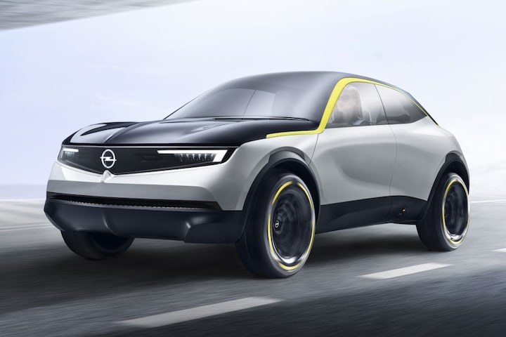
Opel GT X Experimental
The brand color has also been changed. The well-known Opel yellow makes way for a somewhat lighter version. Neon Opel yellow is what they call it. We have seen that color before, namely on the GT X Experimental Concept. The car that anticipated the Mokka. According to Rüsselsheim, this color should reflect the electrical future. From now on, a different font is also used for official publications, called ‘Opel Next’. All in all, according to Opel, it belongs to a new brand identity that emerges in its latest design language: ‘pure and daring’. By mid-2021, the new Opel look should be rolled out on a large scale. The Mokka and the revised Crossland are the first models to debut the revised logo.